From Clutter to Conversion: A Frictionless Cart Experience (Design Pitch)
Cart Page Redesign
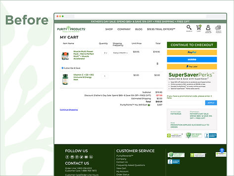
The existing Cart Page was a source of friction, causing unnecessary cognitive load and user drop-off because the layout was fragmented and the primary call-to-action was lost in the noise. My design focused on clarity, structure, and intent, transforming the page into an undeniable path to checkout by leveraging a clean, two-column structure to clearly separate products from the Order Summary, making it instantly scannable. The solution establishes Action Priority by strategically placing the checkout button in the prominent "Order Summary" panel, includes a dedicated Discount section for clear promotional savings, and makes item management intuitive by seamlessly integrating subscription and quantity controls. Furthermore, a smart upsell section was designed for strategic, contextual upselling. This streamlined, high-focus design is anticipated to increase Cart-to-Checkout conversion rates by reducing friction and emphasizing the primary action upon implementation.
Role
Lead Designer
Duration
1 Month
Contribution
UX, Visual Design
Platform
Desktop, Tablet, Mobile