top of page

Simplifying the User Journey to Drive a 25% Increase in Sales
Redesigning the Homepage for Conversion
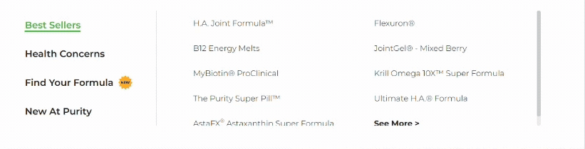
With 3M active users per year visiting Purity Products, the original website architecture was overwhelming and complex, leading to confusion and high bounce rates. My redesign addressed this complexity head-on by shrinking the navigation height, ruthlessly removing over 15 redundant branches from the site architecture, and implementing a guided quiz to personalize the customer experience. We also introduced a high-impact hero imagery strategy to prominently feature promotions and drive action. These changes successfully contributed to a smoother, more efficient user journey and an overall 25% increase in sales.
Role
Lead Designer
Duration
6 Months
Contribution
UX, Visual/Brand Design
Platform
Desktop, Tablet, Mobile


bottom of page